A bright accent can make a familiar suit, dress or jeans-and-shirt combination feel intentional within seconds. The difficulty is not finding a vivid colour; it is deciding how much of it the outfit can support and where it should appear. This guide is useful for women who prefer practical wardrobes but want their looks to feel more individual. The by.olga.shop showroom profile presents women’s clothing and accessories that can be considered as parts of complete outfits rather than isolated purchases.
Your eye chooses a focal point before you analyse the outfit
Visual impressions are formed remarkably quickly. Princeton researchers found that people could begin forming certain first impressions after seeing a face for only 100 milliseconds. A separate nine-study paper showed that subtle clothing cues affected competence ratings even when an image was displayed for 129 milliseconds and participants were instructed to ignore the clothes. These findings do not prove that one colour creates a particular opinion, but they demonstrate how rapidly visual details become part of the overall impression.
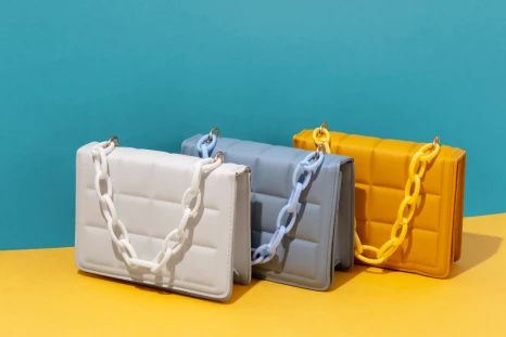
Colour specialist Leatrice Eiseman explains the practical mechanism: “It’s the brighter color that the eye will go to first.” A cobalt bag, red shoe or emerald scarf therefore becomes more than an accessory—it establishes the first point of attention. Before choosing one, it helps to review the current clothing and accessory selections from by.olga.shop and decide which item should lead the composition.
Begin with the role, not with the colour
A successful accent has a job. It may bring attention closer to the face, define the waist, connect two neutral garments or make an understated outfit more memorable. Problems begin when several bright pieces are added without deciding which one should dominate.
Choose the placement according to the result you need
- Near the face: earrings, a scarf, a collar detail or lipstick can brighten the portrait area.
- At the centre: a belt, compact shoulder bag or contrasting top can organise the silhouette.
- At the bottom: colourful shoes add energy while leaving the upper part of the outfit calm.
- Across a larger area: bright trousers, a skirt or jacket require quieter accessories and simpler shapes.
Movement can change how large, shiny or dominant a detail appears. A small bag may attract more attention than expected, while a saturated jacket may look more balanced when seen with the full silhouette. The outfit videos from by.olga.shop can help assess colour, proportion and fabric behaviour beyond a static product photograph.
Use a planning ratio instead of relying on guesswork
The 70/20/10 approach is a useful styling framework rather than a scientific formula. Approximately 70% of the visible outfit is assigned to a calm base, 20% to a supporting shade and 10% to the accent. In a beige suit with an ivory top and a red bag, for example, the bag remains noticeable because it occupies little space and has no equally strong competitor.
The size of the accent matters as much as its hue. When the bright item becomes larger, reduce complexity elsewhere. Saturated trousers work more easily with a plain shirt and restrained shoes. A small vivid earring can coexist with more texture because it occupies less visual area. Reviewing different styling approaches in the short-video collection on Mytrade.kz makes these differences easier to recognise.
A simple scale for everyday decisions
- 5–10% of the visible outfit: jewellery, a narrow belt, lipstick or a small scarf.
- 10–20%: shoes, a handbag, a top or a medium-sized accessory.
- 20–40%: trousers, a skirt, a jacket or another large garment that becomes the main statement.
These percentages are practical reference points, not mandatory measurements. The correct scale depends on colour intensity, body proportions, occasion and personal comfort.
Five controls that prevent colour overload
- Assign one leader. Do not make a bright bag, large earrings and contrasting shoes compete at the same intensity.
- Limit the palette to three colour families. Variations of beige can be treated as one family, leaving space for a supporting shade and one accent.
- Repeat the accent only once. A green bag may be echoed by a small earring or manicure, but exact repetition across every accessory can look overly calculated.
- Combine one active feature with calmer ones. A highly saturated colour works best in a clean shape; a complex shape benefits from a softer shade.
- Check the outfit from two or three metres away. The accent should guide attention, not make the face and silhouette disappear.
Designer Sander Lak described his creative process in four direct words: “We start with color.” He also associated colour with ease, which is an important distinction. A bright detail should not make the wearer feel disguised or uncomfortable. by.olga.shop focuses on ready-to-combine women’s clothing in Almaty, allowing a colour accent to be evaluated together with the base garments that will support it.
Four combinations that are expressive but easy to control
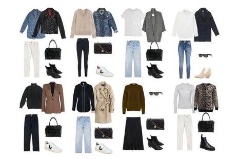
- Charcoal suit, white top and a cobalt bag: the clean base gives the bag a clear visual role.
- Navy dress and red shoes: the contrast is strong enough, so jewellery can remain minimal.
- Denim, an ivory shirt and green earrings: the accent stays close to the face without dominating the entire silhouette.
- Chocolate trousers, a cream knit and a turquoise scarf: three colour families create variety without visual noise.
Recent fashion coverage offers a similar pattern. Pantone identified shades such as Festive Fuchsia and Green Envy among the notable colours of the fall 2026 season, and Vogue observed that designers often used them to lift earth-toned neutrals rather than crowd every part of the outfit with equal intensity. Related wardrobe ideas and seller updates are available in the by.olga.shop news and offers section.
Do not let the accessory become a costume
Costume designer Mona May offered a useful test: “It always comes back to being real to the character.” In everyday dressing, the same principle means that the accent should match the wearer’s routine, temperament and destination. A neon bag may work well for a relaxed meeting, while a smaller jewel-toned detail may be more appropriate for a conservative office environment.
Take one full-length photograph before leaving and examine three things: where the eye goes first, whether the silhouette remains clear and whether the accent suits the situation. If attention jumps between several unrelated details, remove one of them or replace it with a neutral alternative. Additional sellers, products and visual references can be compared through the English version of the Mytrade.kz marketplace.
Let the accent finish the outfit, not fight it
A well-placed bright detail makes a wardrobe more flexible because the same neutral foundation can support several different moods. The safest method is to begin with one focal point, control its scale and repeat its colour no more than once. This creates interest without sacrificing clarity. At by.olga.shop, suits, dresses, basic garments and accessories can be considered as one coordinated system for workdays, informal meetings and special occasions.
A bright accent is particularly effective against a one-colour foundation, provided the base still has depth through texture, shape and tonal variation. The previous article explains this approach in the guide to creating a layered monochrome outfit.