
Colour combinations often seem difficult because shoppers try to judge every shade separately. A blouse may look attractive on its own yet fail to work with the trousers, shoes and outerwear already at home. This guide offers a repeatable way to build a palette, control contrast and test a colour before buying. The by.olga.shop showroom profile on Mytrade.kz presents women’s suits, blouses, bags and accessories that can be assessed as parts of complete outfits rather than isolated items.
Start with an anchor colour, not a collection of favourites
The safest outfit begins with one anchor colour. It usually belongs to the largest garment: a suit, coat, dress, jacket or pair of trousers. Every other shade should either support that anchor or create a deliberate point of contrast.
This approach matters because a large wardrobe does not automatically create more combinations. Research by WRAP found that the average UK adult owned 118 items of clothing, while 26%—approximately 31 garments—had not been worn for at least a year. These figures describe the UK rather than Kazakhstan, but they illustrate a common buying problem: an attractive item can remain unused when it has no clear relationship with the rest of the wardrobe.
Give every colour a specific job
| Colour role | Typical proportion | Suitable garments | Main purpose |
|---|---|---|---|
| Anchor | About 50–70% | Suit, coat, dress, trousers | Creates the overall direction of the outfit |
| Supporting shade | About 20–40% | Blouse, knitwear, shoes | Connects the main garment with the rest of the look |
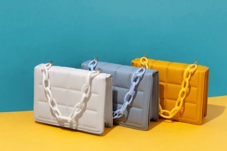
| Accent | About 5–15% | Bag, scarf, jewellery, belt | Directs attention without overwhelming the outfit |
These percentages are a visual guide rather than a strict mathematical rule. A long coat naturally occupies more space than a handbag. The useful principle is hierarchy: one colour leads, one supports and one adds interest.
Judge shades by value and intensity before temperature
Many people begin by asking whether a colour is warm or cool. That distinction can help, but two other characteristics are often easier to see and more important in daily dressing: value and intensity.
| Characteristic | Question to ask | Low-risk method |
|---|---|---|
| Value | Is the colour light, medium or dark? | Combine neighbouring values for a softer effect or light and dark values for sharper contrast. |
| Intensity | Is the shade bright, clear and saturated or muted and greyed? | Use one highly saturated colour and keep the remaining pieces quieter. |
| Temperature | Does the shade lean towards yellow and red or towards blue and grey? | Choose one temperature as the main direction and use the opposite only as a controlled accent. |
Josef Albers summarised the problem in three words: “colour deceives continually.” A beige fabric may appear warm beside grey, cooler beside camel and darker beside white. The shade has not changed physically; its visual context has changed. This is why garments should be compared side by side rather than selected from colour names alone.
When viewing current women’s clothing offers from by.olga.shop, consider which existing garment could act as the anchor and which pieces would support it. A new purchase is more useful when it completes at least three realistic outfits.
Four colour formulas for everyday dressing
You do not need to memorise the entire colour wheel. The following formulas cover most work, leisure, meeting and evening situations while leaving enough room for personal style.
| Formula | Example palette | Best suited to | Why it works |
|---|---|---|---|
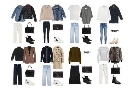
| Neutral plus one accent | Charcoal + ivory + burgundy | Work, meetings, dinners | The neutral base keeps the brighter shade controlled. |
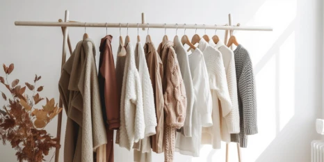
| Light monochrome | Cream + sand + caramel | Daytime and relaxed occasions | Different values add depth without introducing competing colours. |
| Dark monochrome | Denim blue + navy + ink blue | Travel and everyday wear | A single colour family makes separate garments look connected. |
| Muted contrast | Olive + dusty rose + warm beige | Informal meetings and weekends | Opposing colour directions are softened by reduced intensity. |
A useful test is to cover the accent item with your hand. The remaining outfit should still look complete. Then uncover it: the accent should improve the composition rather than rescue a combination that does not work.
Match the strength of the outfit to your natural contrast
Seasonal colour classifications can become complicated, but natural contrast can be estimated without a detailed system. Look at the difference between your hair, skin, eyebrows and eyes. Soft transitions usually work well with related shades and moderate value differences. Strong natural contrast can carry clearer light-and-dark combinations.
A quick contrast check
- Take a photograph in indirect daylight without a beauty filter.
- Convert the photograph to black and white.
- Observe whether the face, hair and eyebrows create a soft, medium or strong value difference.
- Repeat a similar level of contrast in the clothing near your face.
- Place unfamiliar or difficult colours below the waist or use them in a small accessory first.
A colour that does not flatter the face is not necessarily unusable. Move it from a blouse to trousers, a skirt, shoes or a bag. Near the face, introduce a more supportive collar, scarf, jacket lapel or piece of jewellery.
Leatrice Eiseman of the Pantone Color Institute has described successful fashion colour as a balance between “the more familiar and the new and exciting.” In practical wardrobe terms, this means keeping a recognisable neutral foundation while introducing novelty through one controlled element.
Why fabric and lighting can change the colour you see
A shade on a phone screen is not a complete description of the garment. Camera settings, screen brightness, artificial lighting, fibre structure and surface shine all affect appearance. Satin creates bright reflections, brushed fabric absorbs and scatters light, while textured knitwear introduces small shadows that make a single colour appear more complex.
Colour science also recognises metamerism: two materials can appear to match under one light source but look different under another. Therefore, compare clothing under at least two conditions—natural window light and the artificial lighting normally used at home or work.
Movement provides additional information because folds continuously change the angle of reflected light. Reels featuring by.olga.shop clothing can help viewers assess how colour, texture and silhouette behave beyond a static product image.
For broader visual comparison, the short-video collection on Mytrade.kz allows different materials, palettes and styling approaches to be viewed in motion.
The six-question fitting-room test
- What is the anchor colour of this outfit?
- Are the other shades supporting it or competing for attention?
- Does the strongest colour sit where I want people to look?
- Can I name three existing items that work with this garment?
- Does the colour remain convincing in both daylight and artificial light?
- Can I wear the resulting combination in at least three real situations?
Photograph successful combinations and record their three main colours. After several weeks, a personal pattern becomes visible: perhaps navy works better than black, cream is easier than optical white, or muted green combines with more of the wardrobe than bright emerald. Practical wardrobe guidance can also be followed through the by.olga.shop news and offers section.
Small mistakes that make a palette look accidental
- Using three equally bright colours, leaving the eye without a clear focal point.
- Matching colour names instead of comparing the actual fabrics together.
- Introducing a bright bag, bright shoes and a contrasting jacket in the same outfit.
- Forgetting that every colour in a print already counts as part of the palette.
- Trying to find two almost identical shades and accepting a near match that looks unintentional.
- Assessing the garment only on a hanger rather than beside the face, footwear and accessories.
When comparing products on the Mytrade.kz marketplace, replace the question “Is this colour fashionable?” with three more useful questions: what role will it play, what will I wear it with and how often can I rebuild the combination?
A wearable palette should make tomorrow easier
A reliable colour system does not remove personality from an outfit. It creates enough structure for colour to look deliberate: one anchor, one supporting direction and one controlled accent. by.olga.shop in Almaty presents women’s suits, blouses, bags and accessories that can be considered as coordinated looks for everyday wear, meetings and special occasions. Once the palette is clear, the next step is connecting it with wardrobe essentials; continue with the previous guide to styling basics without creating a dull outfit.